
From top: congregation in northern California; tattoo design; social media identity for the Adrienne Arsht Latin America Center
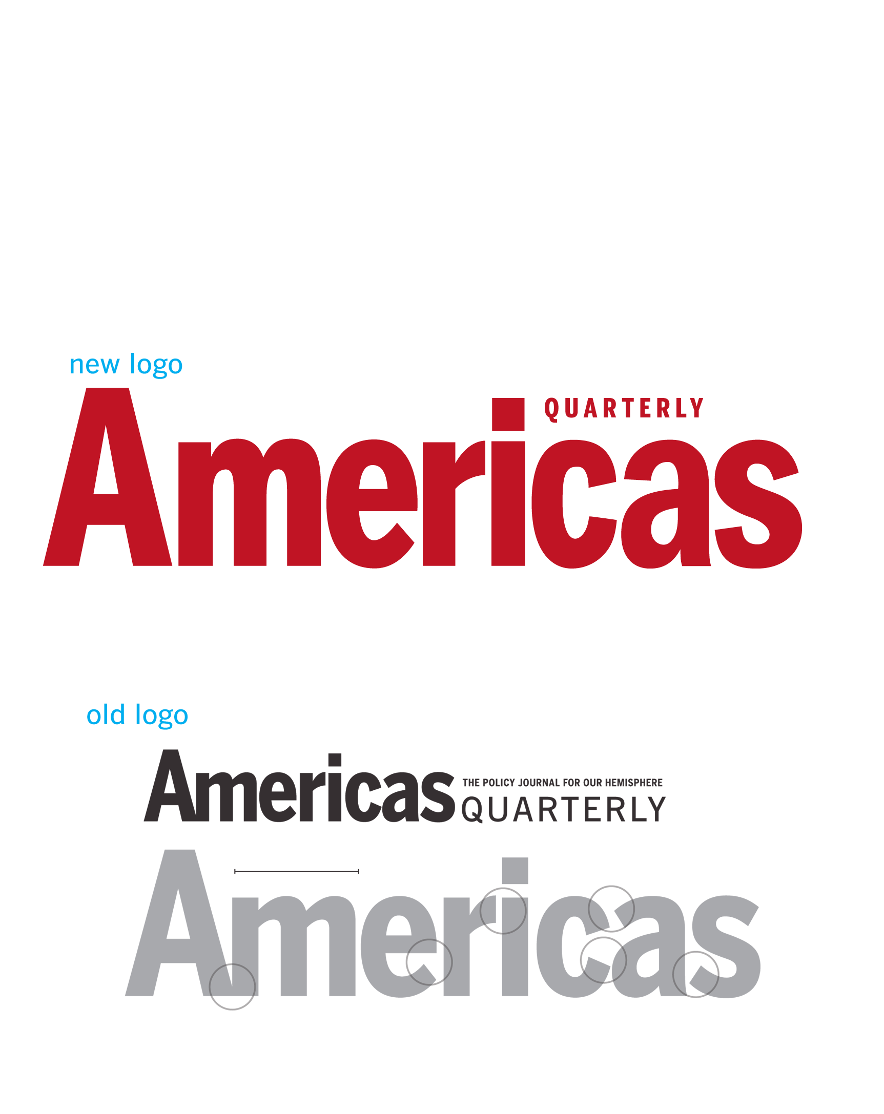
Based on different versions of gothic typefaces, I redrew the logo to make a more consistent, even combination of letters from the original typeset logo.
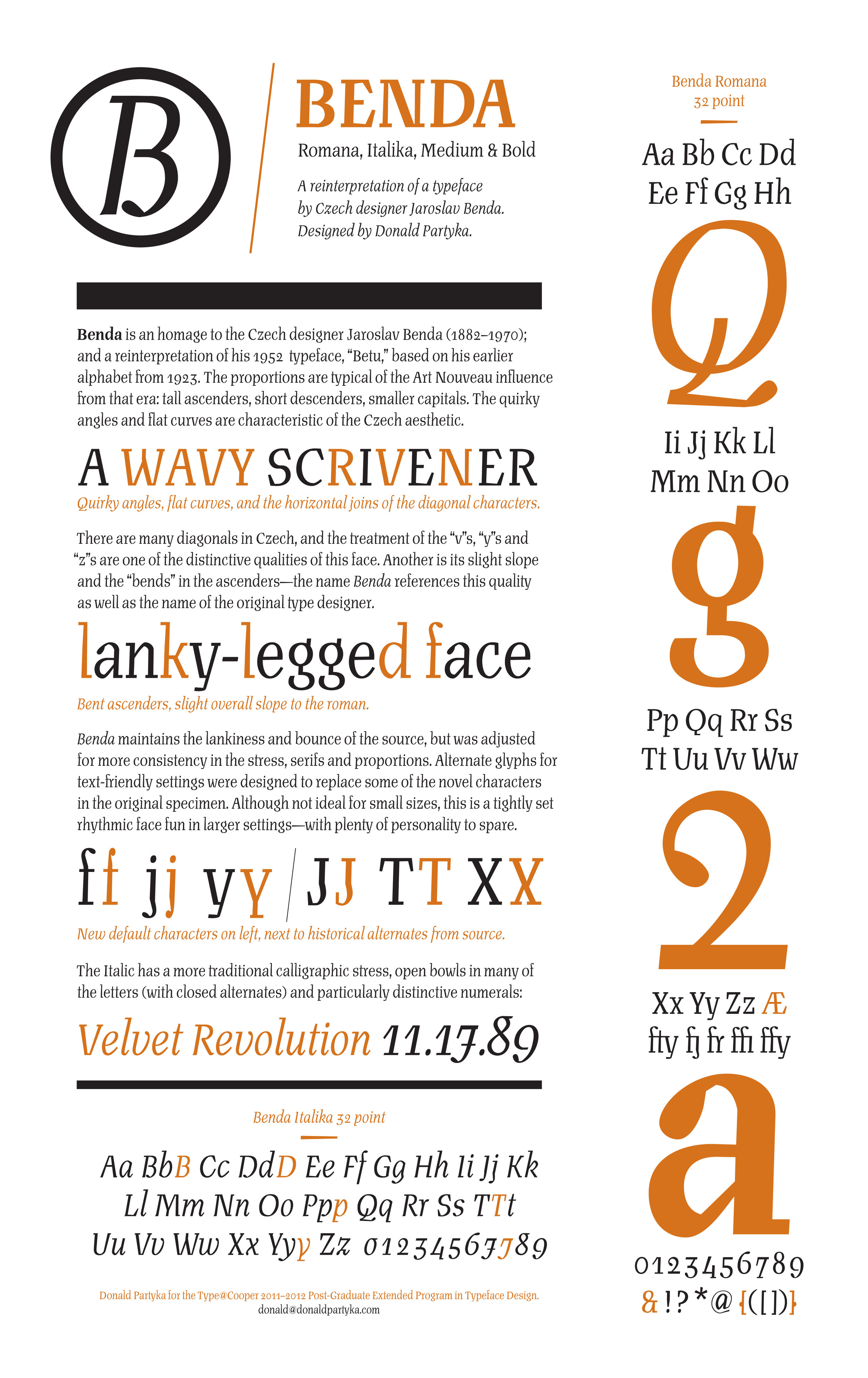
Specimen poster for my typeface Benda, designed while studying at Cooper Union's Post-Graduate Certificate Program in Typeface Design.
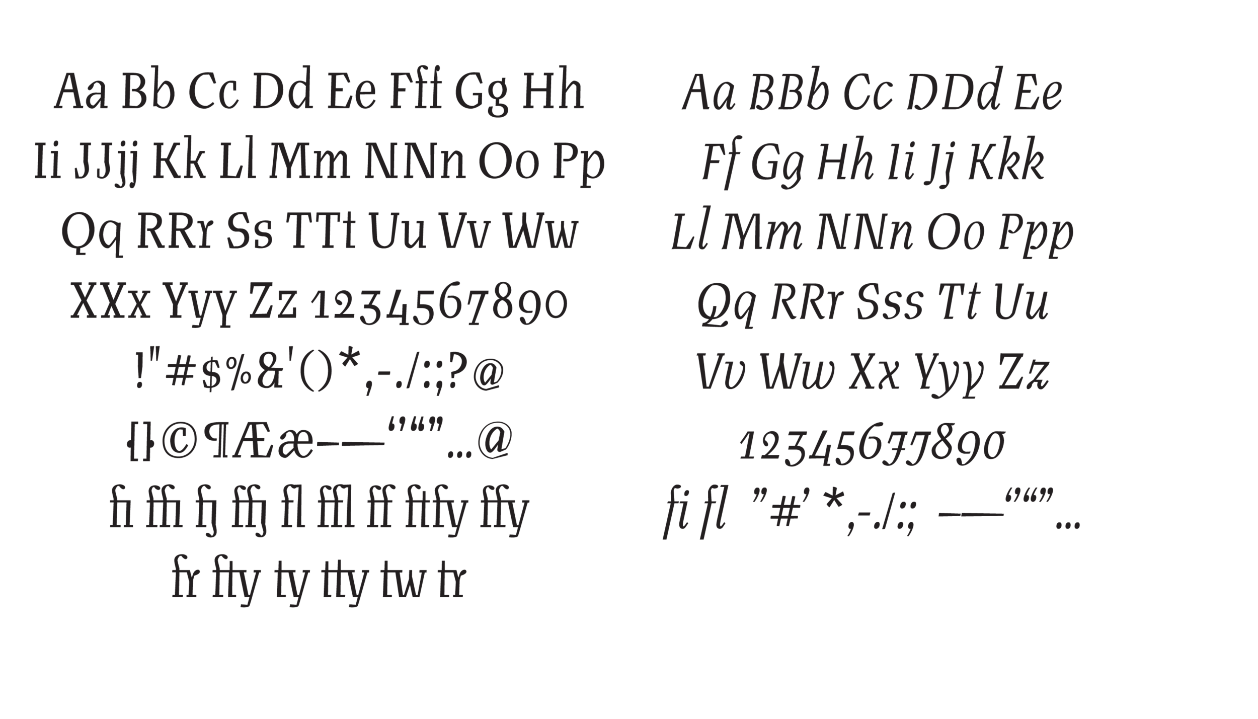
Romana and Italika, from my typeface Benda, designed while studying at Cooper Union's Post-Graduate Certificate Program in Typeface Design.
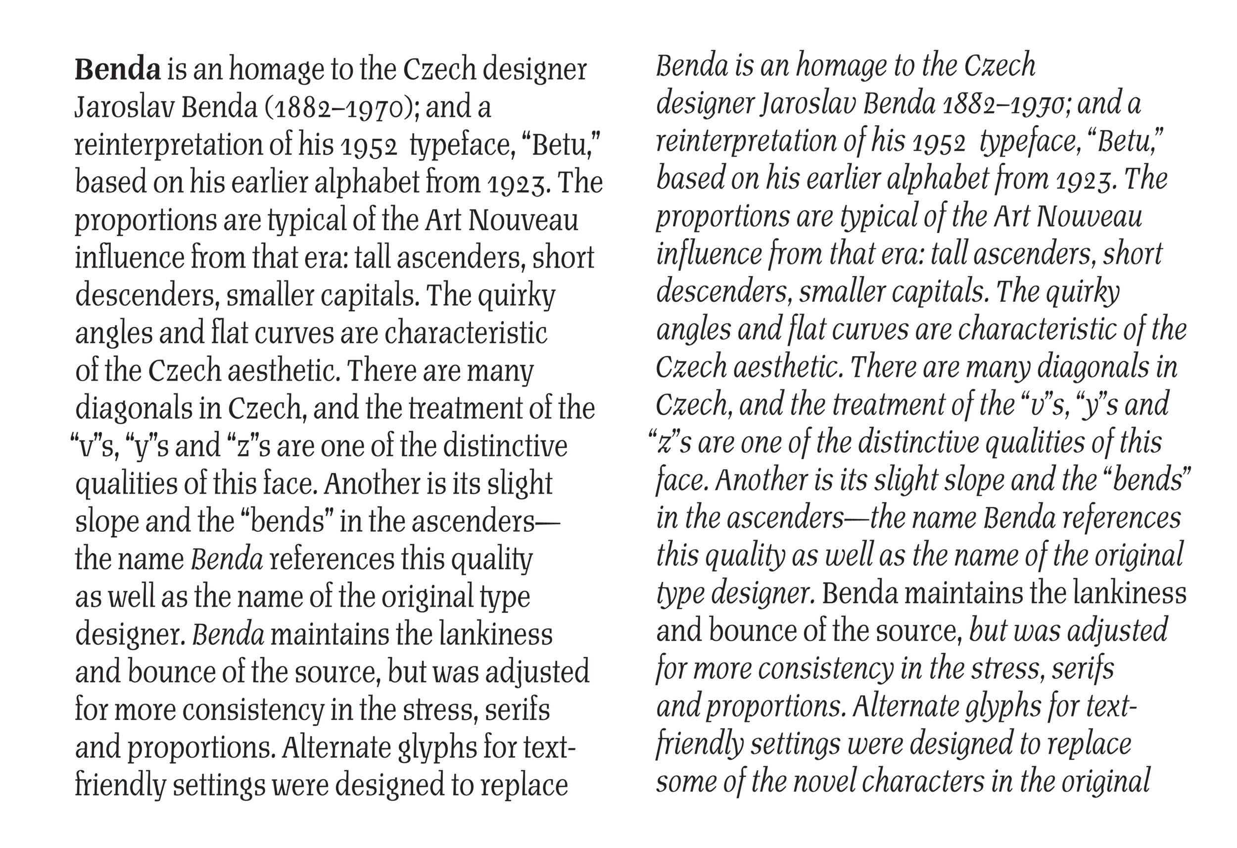
Text settings for my typeface Benda, designed while studying at Cooper Union's Post-Graduate Certificate Program in Typeface Design. Although a display type, evenness of contrast in the letterforms make the letters legible in text settings.
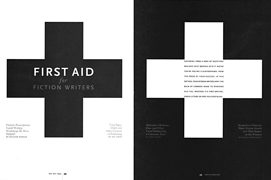
Type solution for an opening section of the Poets&Writers redesign, recognized by the Society of Publication Designers.
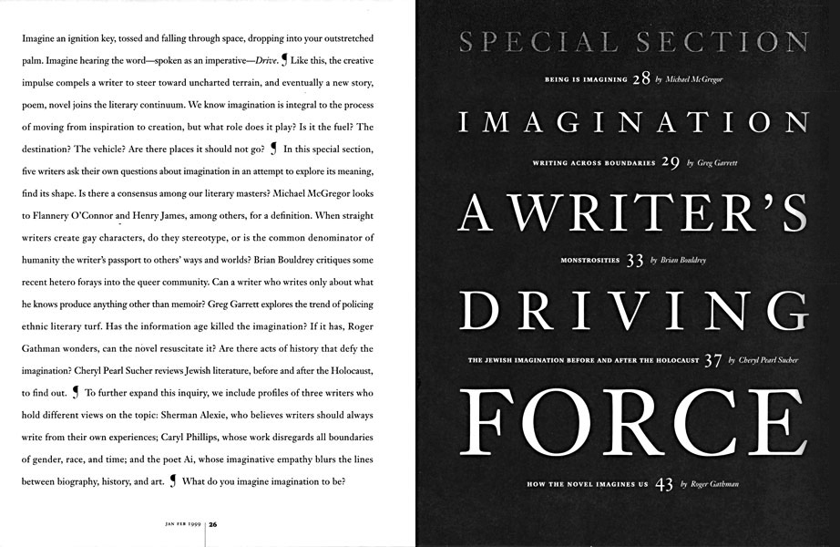
Spread introducing a special section from the redesign of Poets&Writers magazine.
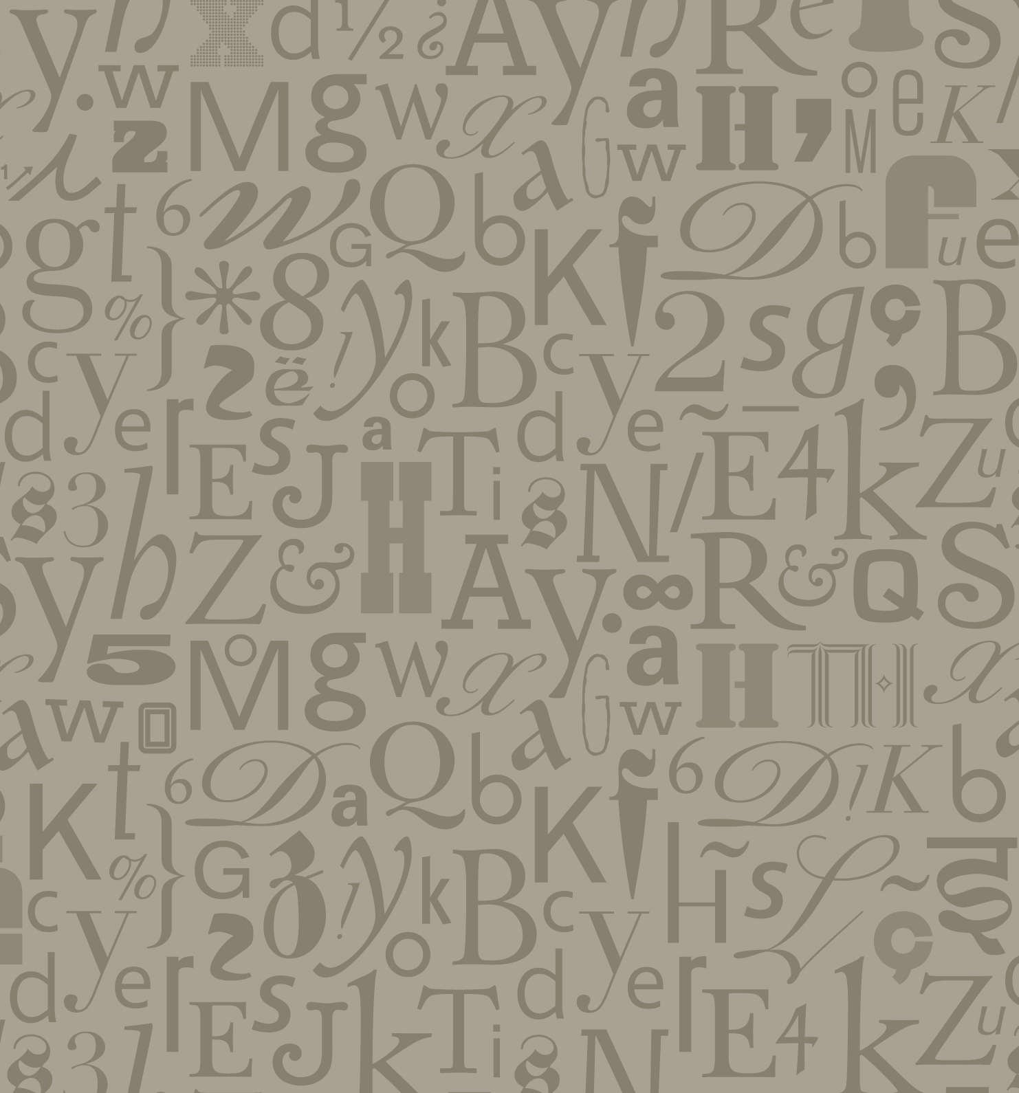
Detail of endpaper design using various display and text faces for the book Typography, Referenced.
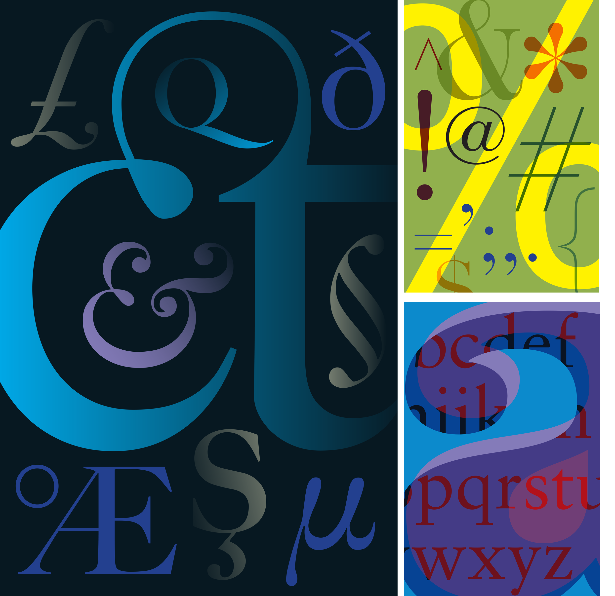
Proposed backgrounds for a lynda.com series on typography. The backgrounds needed to be bright and bold for filming.
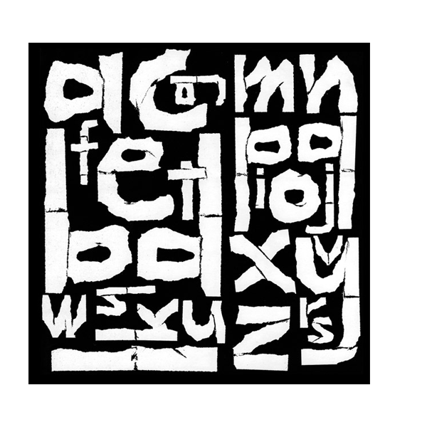
Experimental personal piece recognized in Letter Arts Review Annual


From top: congregation in northern California; tattoo design; social media identity for the Adrienne Arsht Latin America Center
Based on different versions of gothic typefaces, I redrew the logo to make a more consistent, even combination of letters from the original typeset logo.
Specimen poster for my typeface Benda, designed while studying at Cooper Union's Post-Graduate Certificate Program in Typeface Design.
Romana and Italika, from my typeface Benda, designed while studying at Cooper Union's Post-Graduate Certificate Program in Typeface Design.
Text settings for my typeface Benda, designed while studying at Cooper Union's Post-Graduate Certificate Program in Typeface Design. Although a display type, evenness of contrast in the letterforms make the letters legible in text settings.
Type solution for an opening section of the Poets&Writers redesign, recognized by the Society of Publication Designers.
Spread introducing a special section from the redesign of Poets&Writers magazine.
Detail of endpaper design using various display and text faces for the book Typography, Referenced.
Proposed backgrounds for a lynda.com series on typography. The backgrounds needed to be bright and bold for filming.
Experimental personal piece recognized in Letter Arts Review Annual